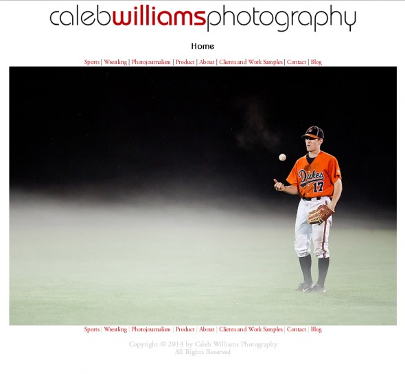
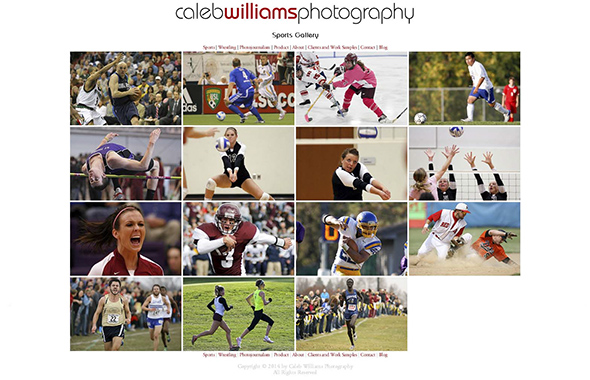
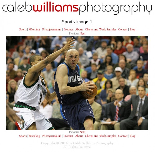
After quite a few days of research, coding, uploading, testing, debugging and re-uploading, the main Caleb Williams Photography website is now live with an all-new code structure designed to give all users the best visual experience when visiting the Caleb Williams Photography website. Using responsive web design, the Caleb Williams Photography website now supports viewers on smartphones and tablets so they should be able to see the site without having to scroll through huge images and awkward navigation.

As always, the purpose of the Caleb Williams Photography is to highlight imagery, so the same clean design remains. It’s just cleaner. In fact, you may not notice the changes, and that’s a good thing because that means you’re too busy looking at the pictures.


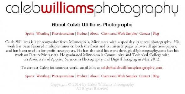
The website now features typefaces that reflect the Caleb Williams Photography logo: Bauhaus Standard and Adobe Garamond Pro. This is best illustrated by the About page.

Of course nothing is perfect and neither is this site, so if you see any issues, please contact me and I’ll do my best to address it in a timely manner.
Tech specs
For those interested in the tech stuff, the site was coded in Adobe Dreamweaver CS6 (but coded by hand) using HTML5, CSS3 and PHP 5. A very small amount of JavaScript (thanks Google Analytics) appears as well.
Tons of props go to my friend Jen Ritt who inspired me to start this redesign and allowed me to test iPhone compatibility and gave me tons of ideas. Fortunatly I didn’t have to reinvent the wheel with the help of vavious parts of web designer wall, Stack Overflow and John Paul Mueller’s CSS3 for Dummies.
